
For Homecoming 2018 at the University of Central Florida, the Homecoming Executive Board gave my team and I the visual direction of creating a campaign centered around nostalgic tourism, vintage greeting cards, weathered colors, and grainy textures. To effectively communicate their vision with myself and my fellow coworkers at Design Group, we were provided the following mood board as a source of inspiration when working on our selected homecoming event.
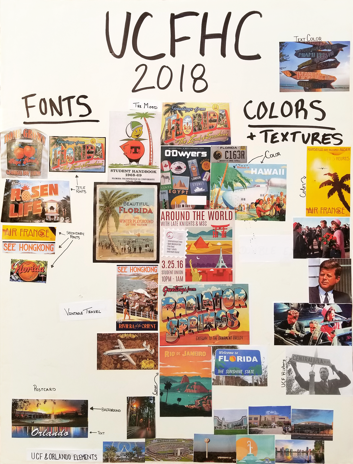
Mood board provided by the Homecoming Board
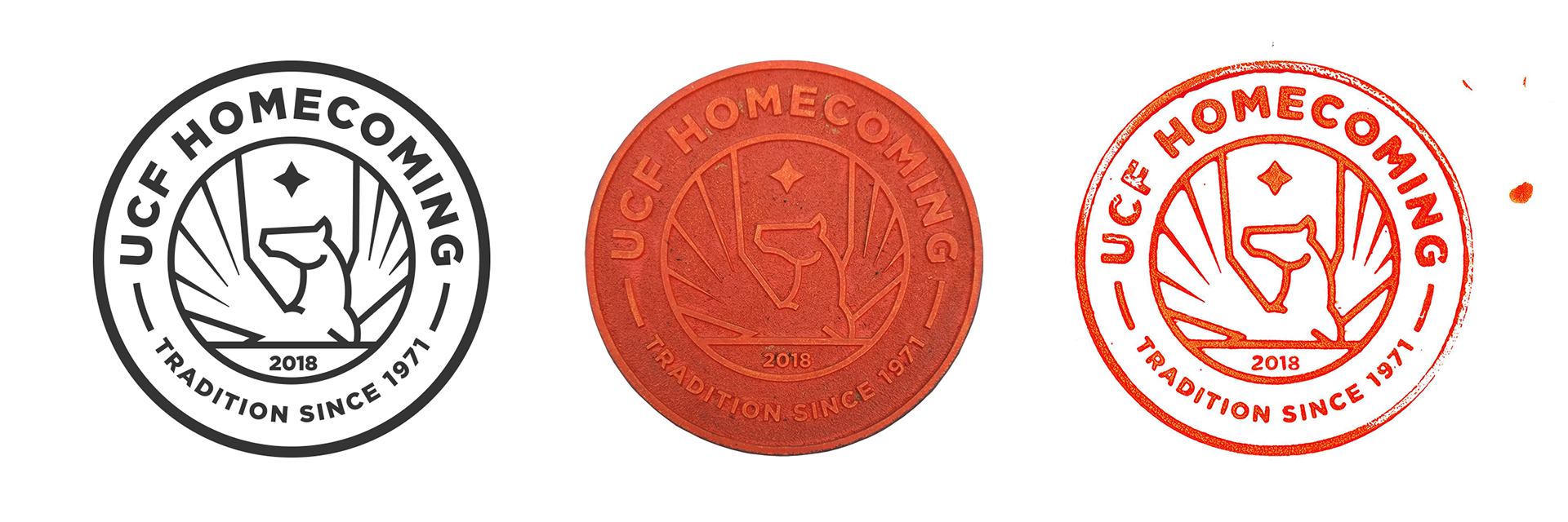
This was the first year that the Homecoming board elected to forgo a "theme" and instead wanted to focus on an aesthetic. To add a sense of cohesion, my team and I developed this stamp like logo that would appear across the campaign in its entirety. The logo was treated as a logo system and appeared in various ranges of adherence as if it truly had been stamped on. To make this effect as authentic as possible, the logo was laser cut, used as a stamp, then scanned into the computer.
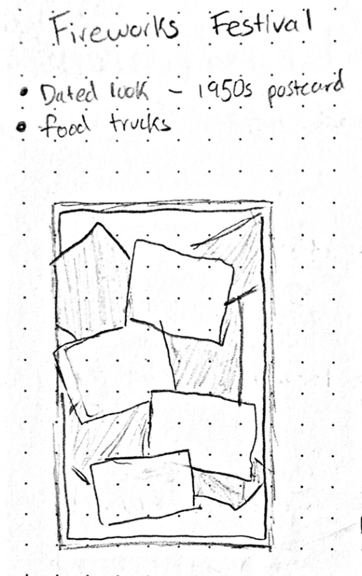
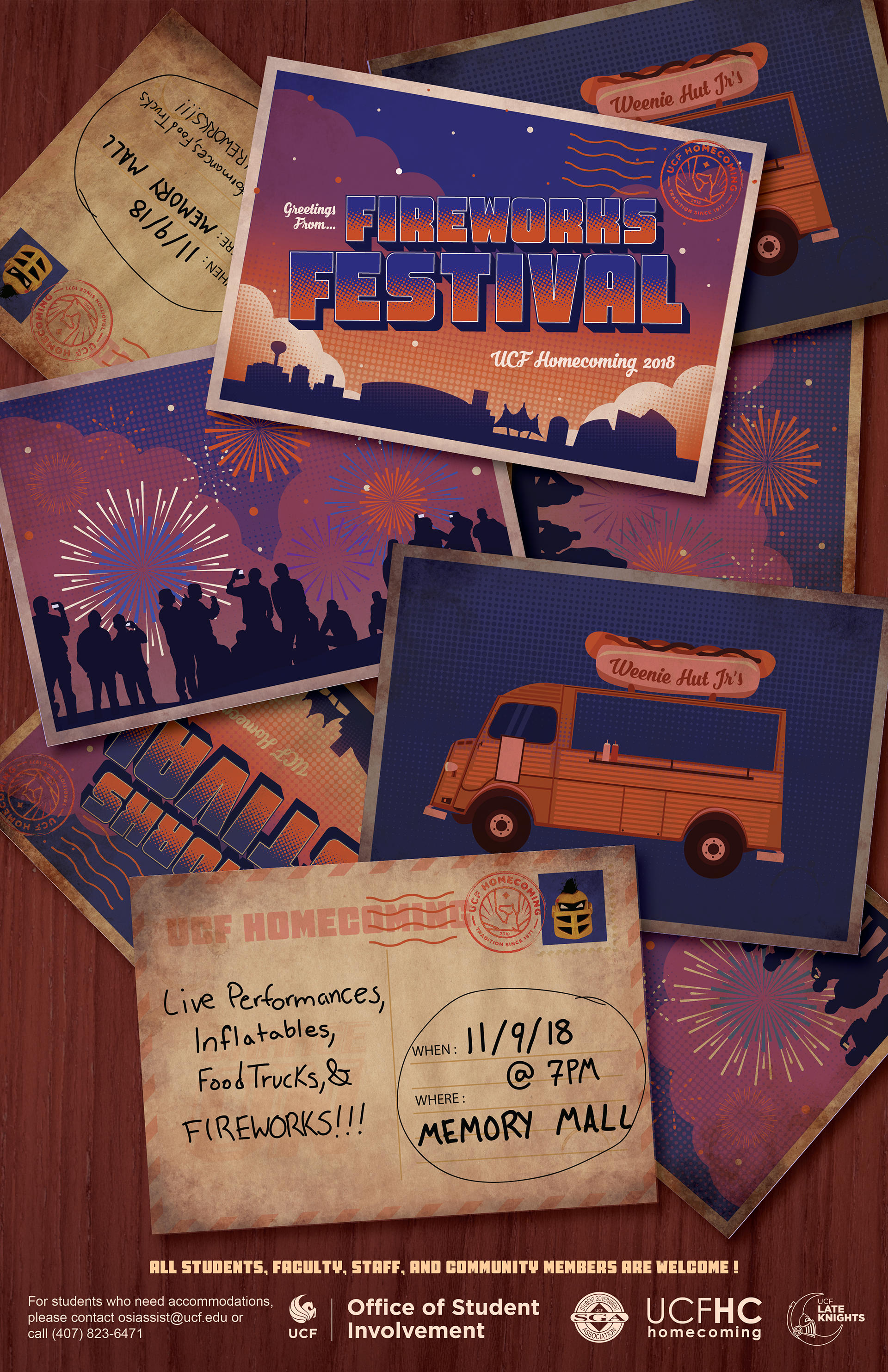
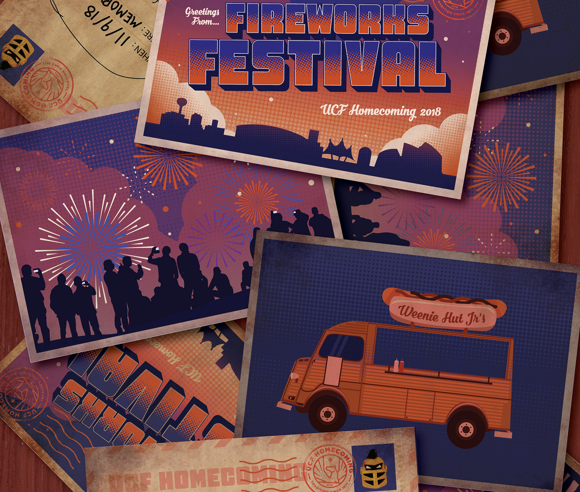
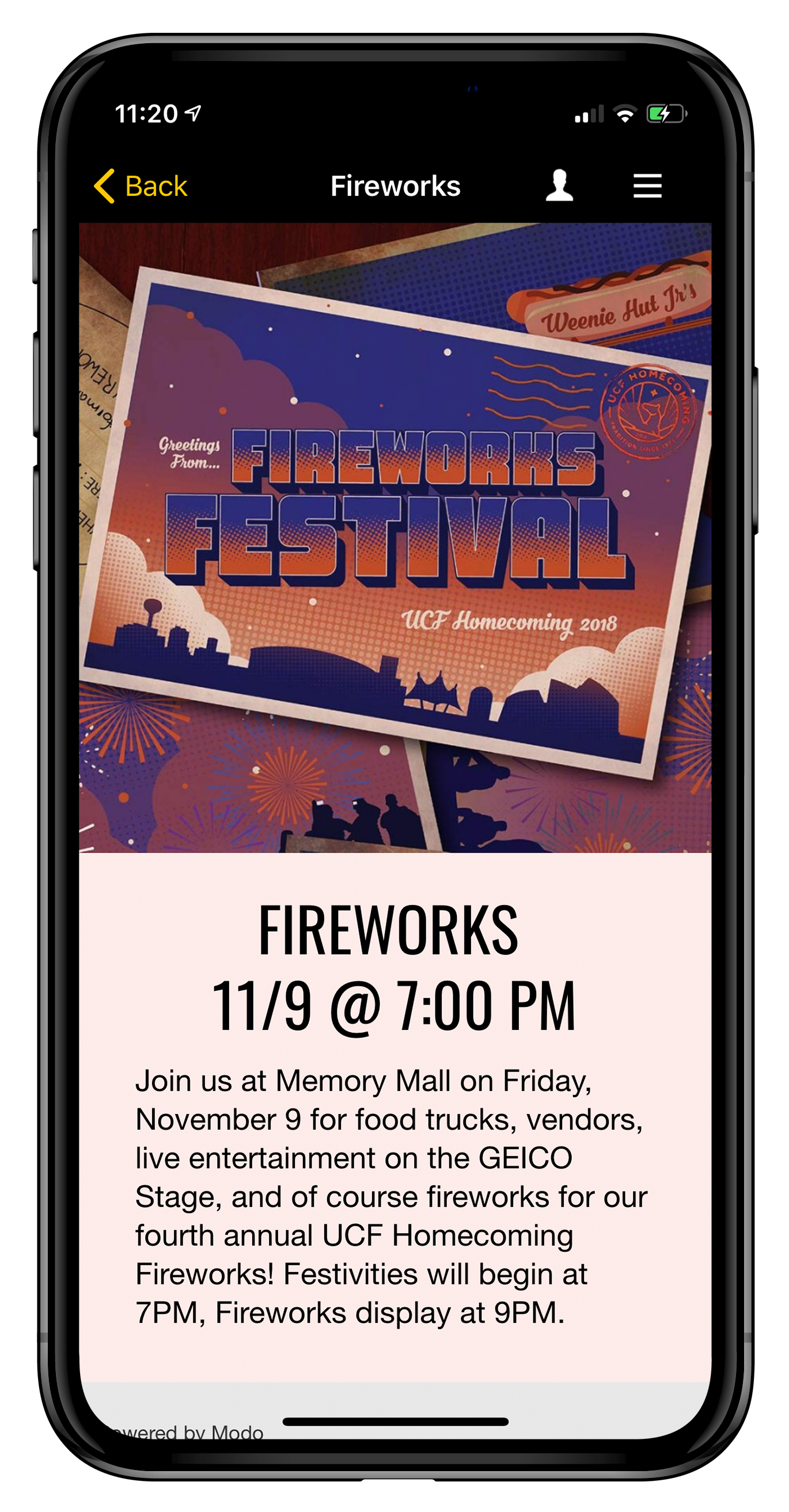
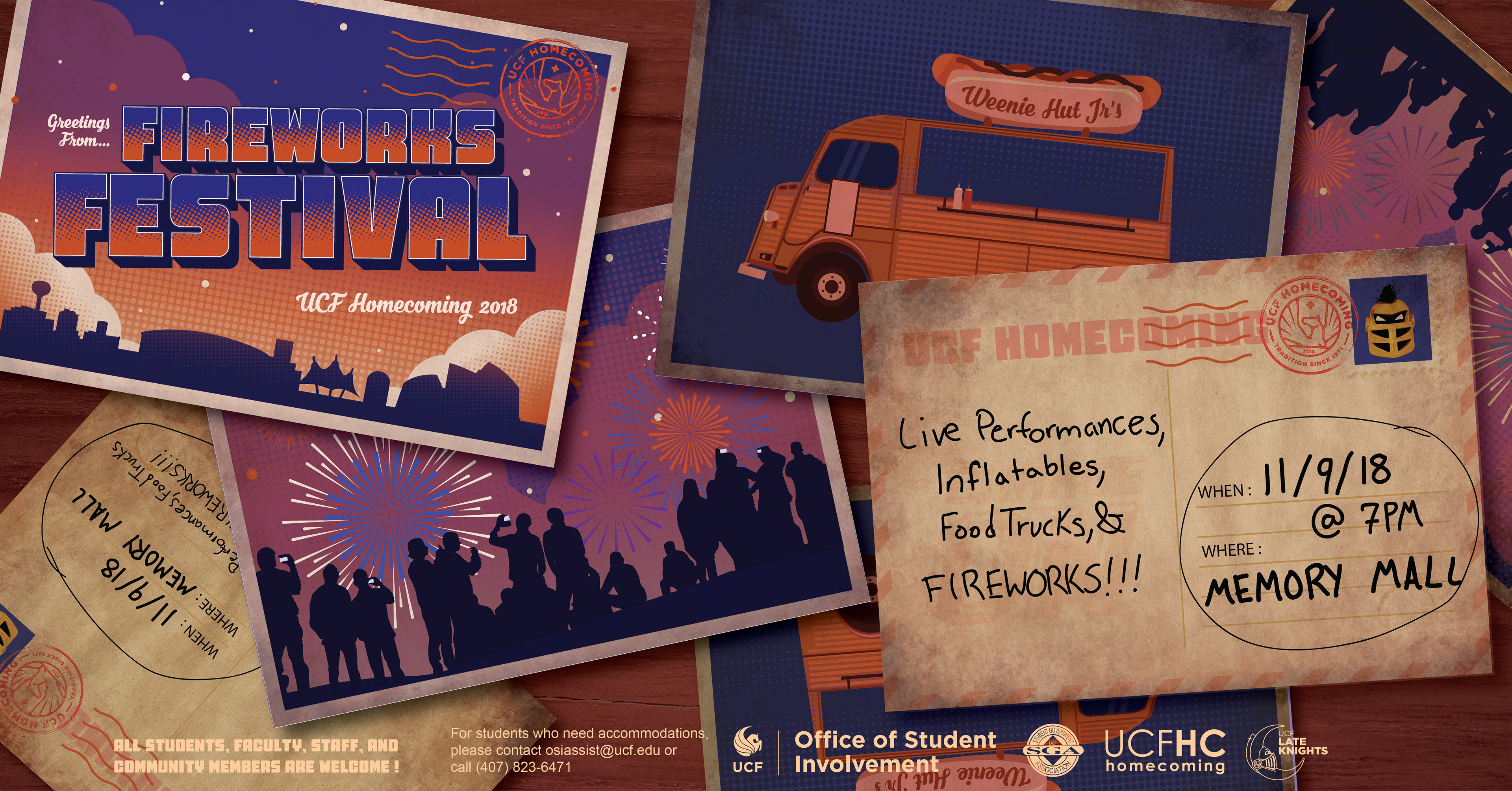
My first task within this campaign was to create the graphics for the Fireworks Festival. As one of the lesser established events that happen during Homecoming Week, this event and the graphic had to encapsulate the feeling of excitement to drive more people to want to come out. Below is a sketch of just how I planned to do that.

In terms of layout, I wanted to push beyond the traditional poster layout many go for and create a layout that rewards you for letting your eye travel throughout it. I consciously made the postcard with the event's name not as grungy as the rest to give the viewer a clear place to start. Still if the viewer doesn't take the time to consider every single postcard on the poster, the event information stands out to quickly share the most pertinent information about this event.
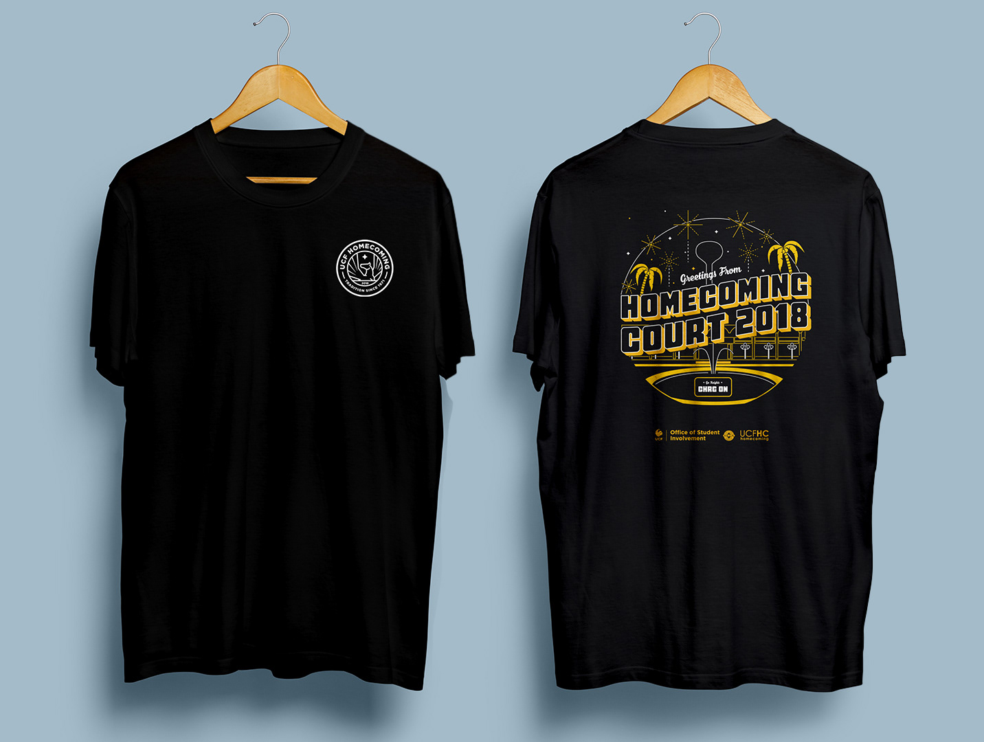
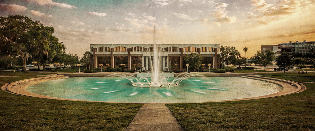
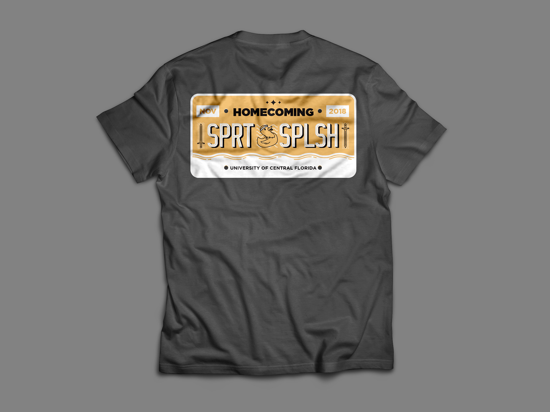
The next thing that I was responsible for was designing the shirt that the UCF Homecoming Royalty Court Nominees would wear at select events throughout the week. This shirt had to fit in with the others designed for the campaign, yet be distinct enough to stand out from the rest. For this design, I decided to feature an area of the UCF campus that's important for Spirit Splash and a campus icon, the Reflecting Pond.
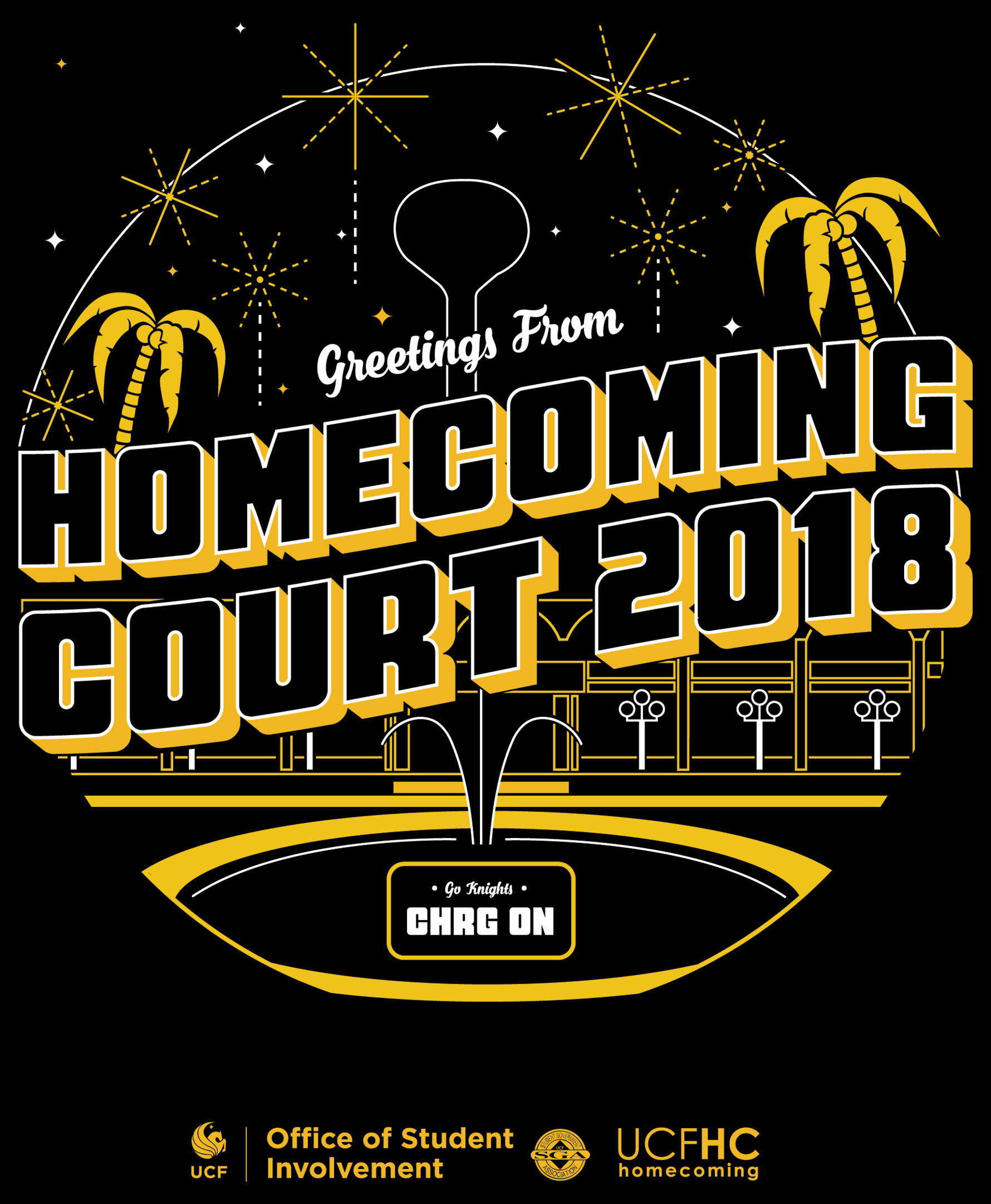
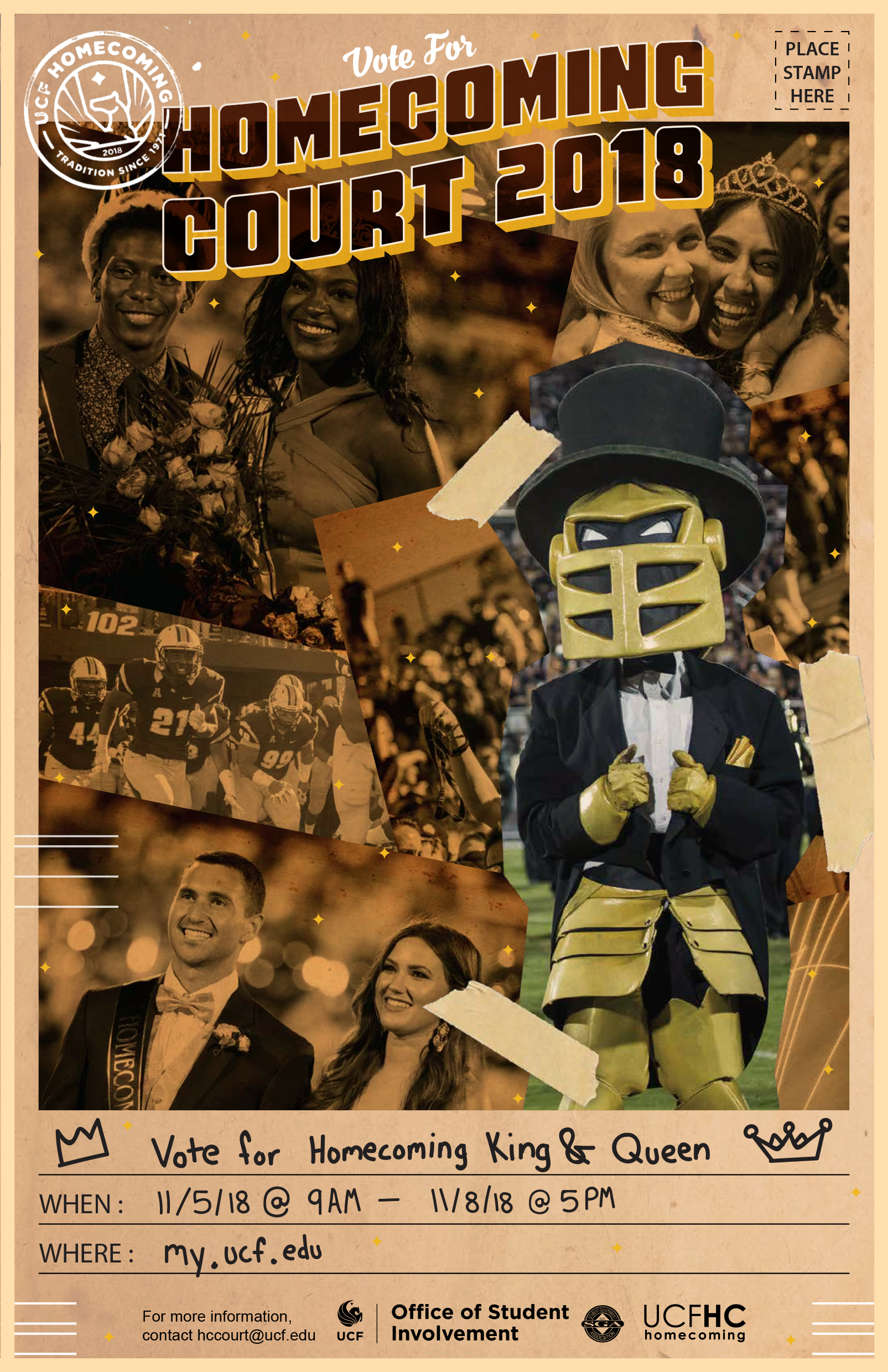
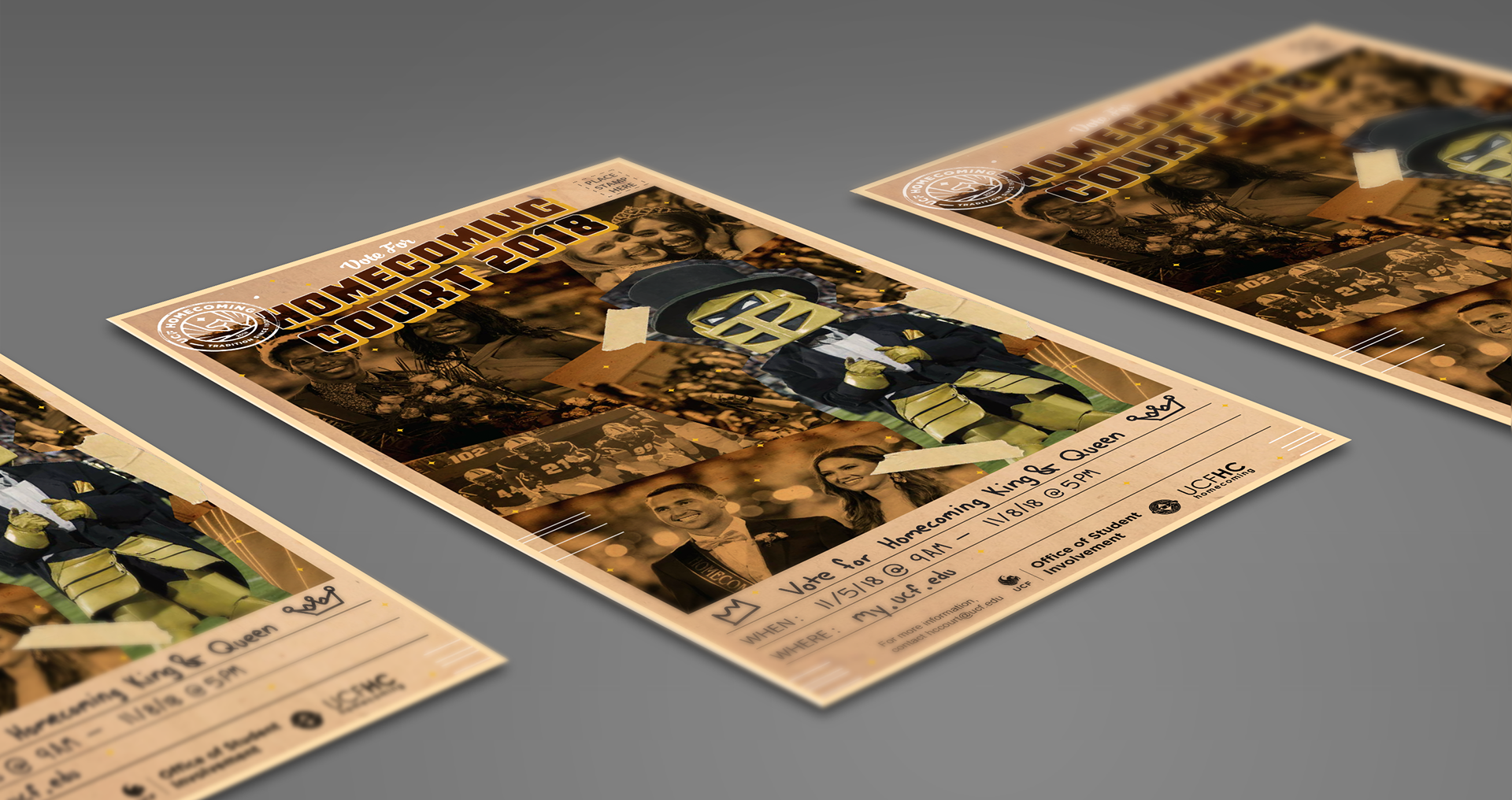
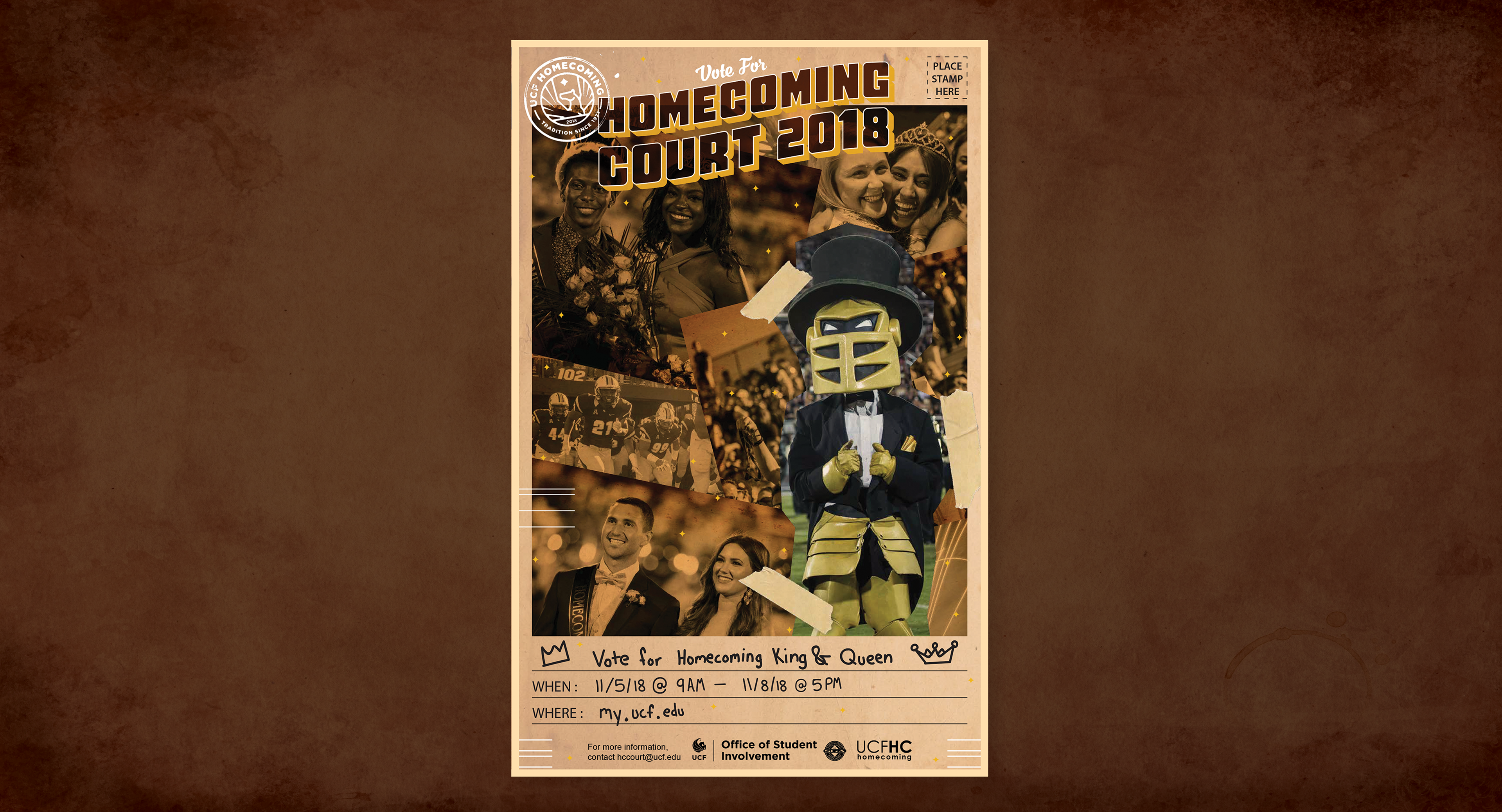
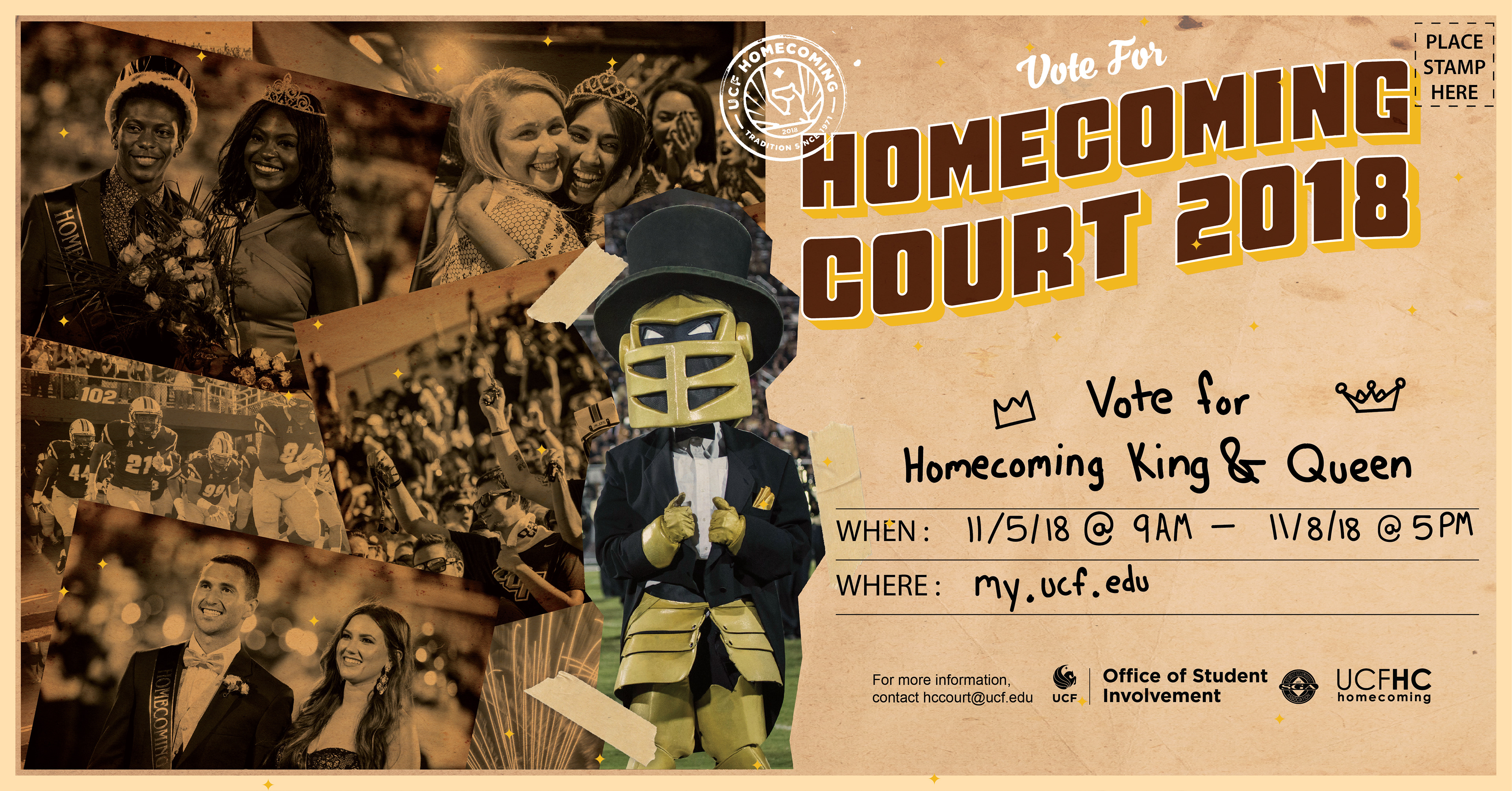
Finally, my last contribution to the campaign was to design the Homecoming Court Voting Promo. For the promotion, I wanted to highlight the sense of history behind selecting Homecoming Court, so I gathered multiple photos from past courts and applied various filters to make them look dated. I then composited them together and designed the event graphic to look like an old postcard.
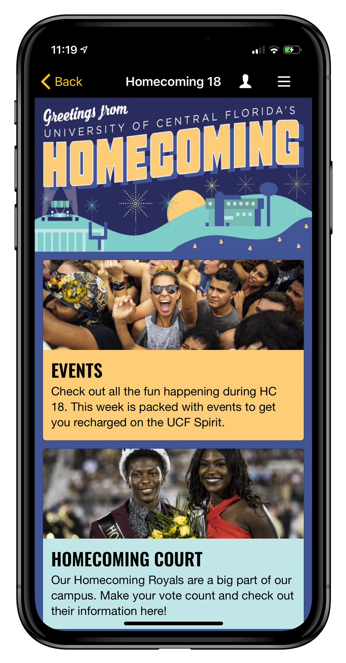
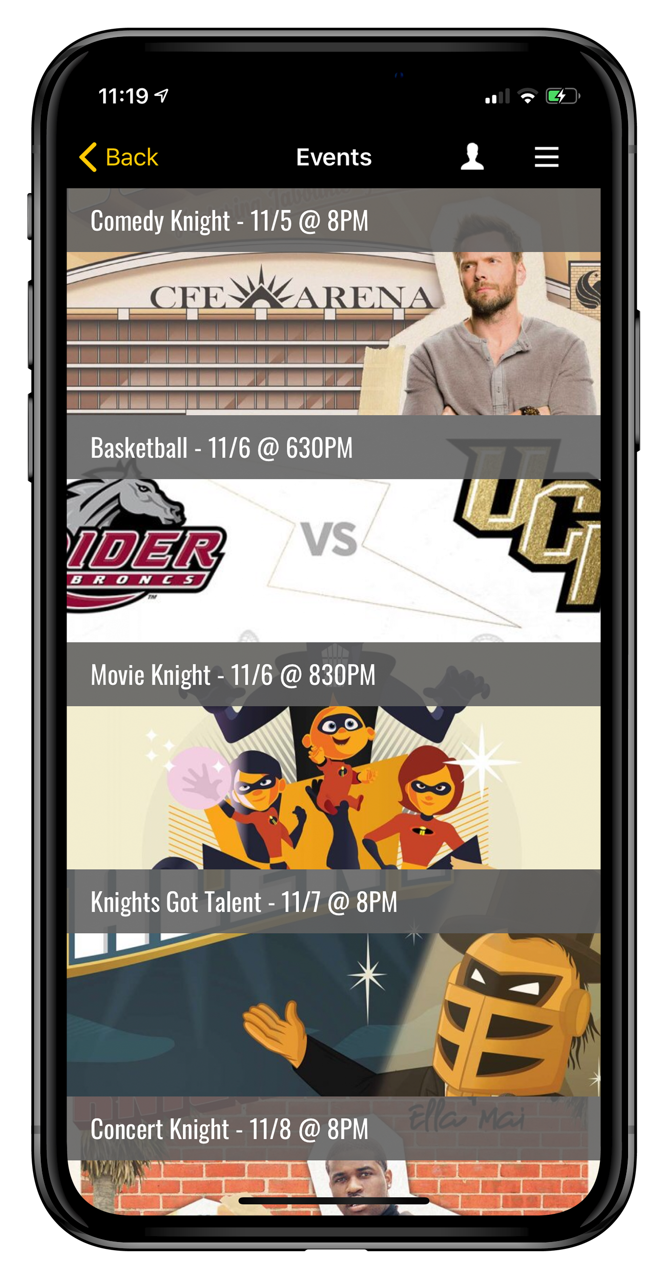
To provide a sense of how the entire campaign came together, below are graphics from a select few of the entire team responsible for branding Homecoming 2018. While every piece doesn't look identical to one another, there's a visual thread that connects them all.
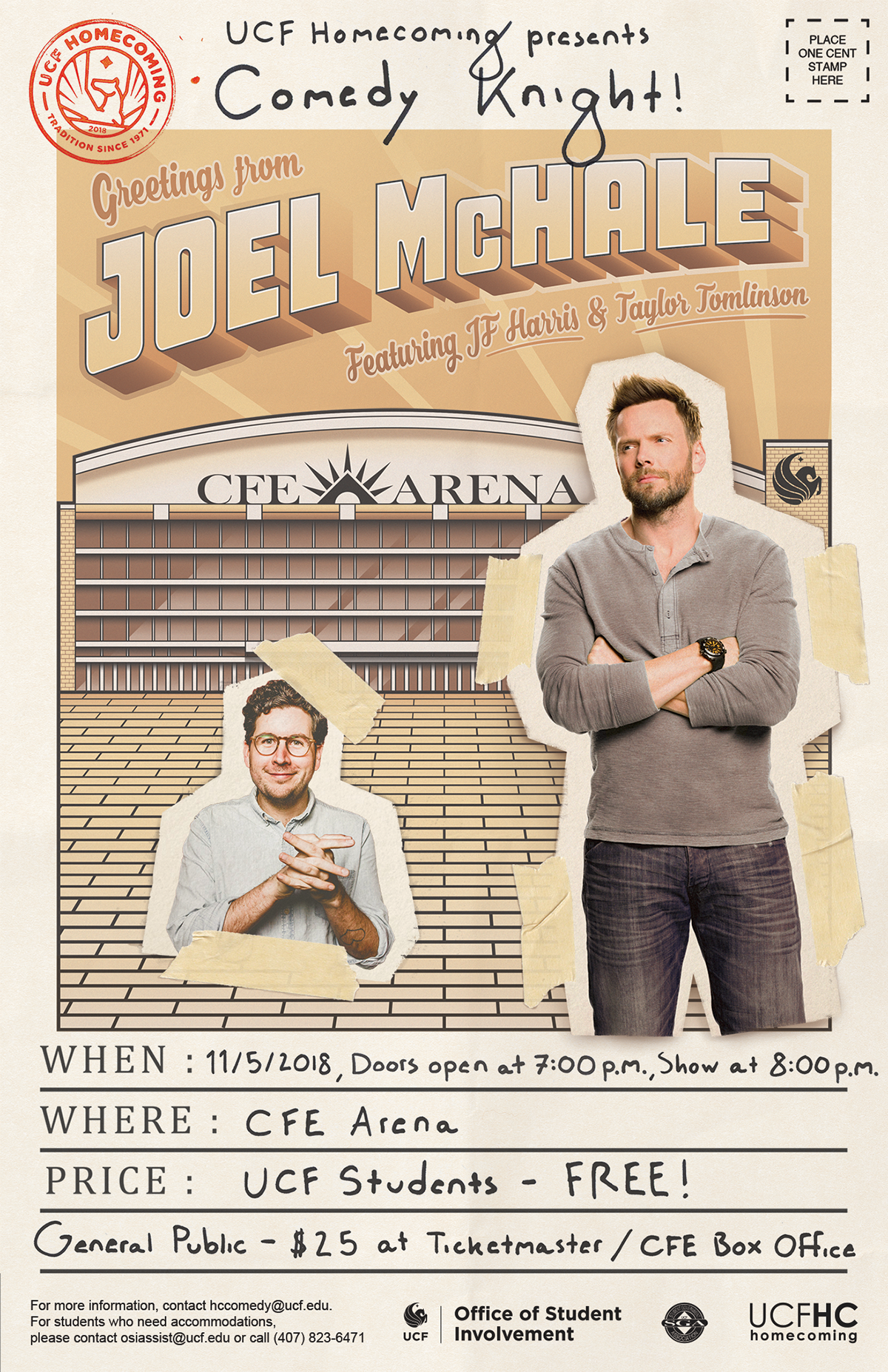
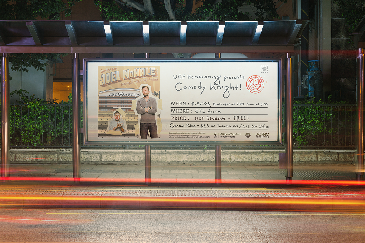

Comedy Knight: Jason Ferry
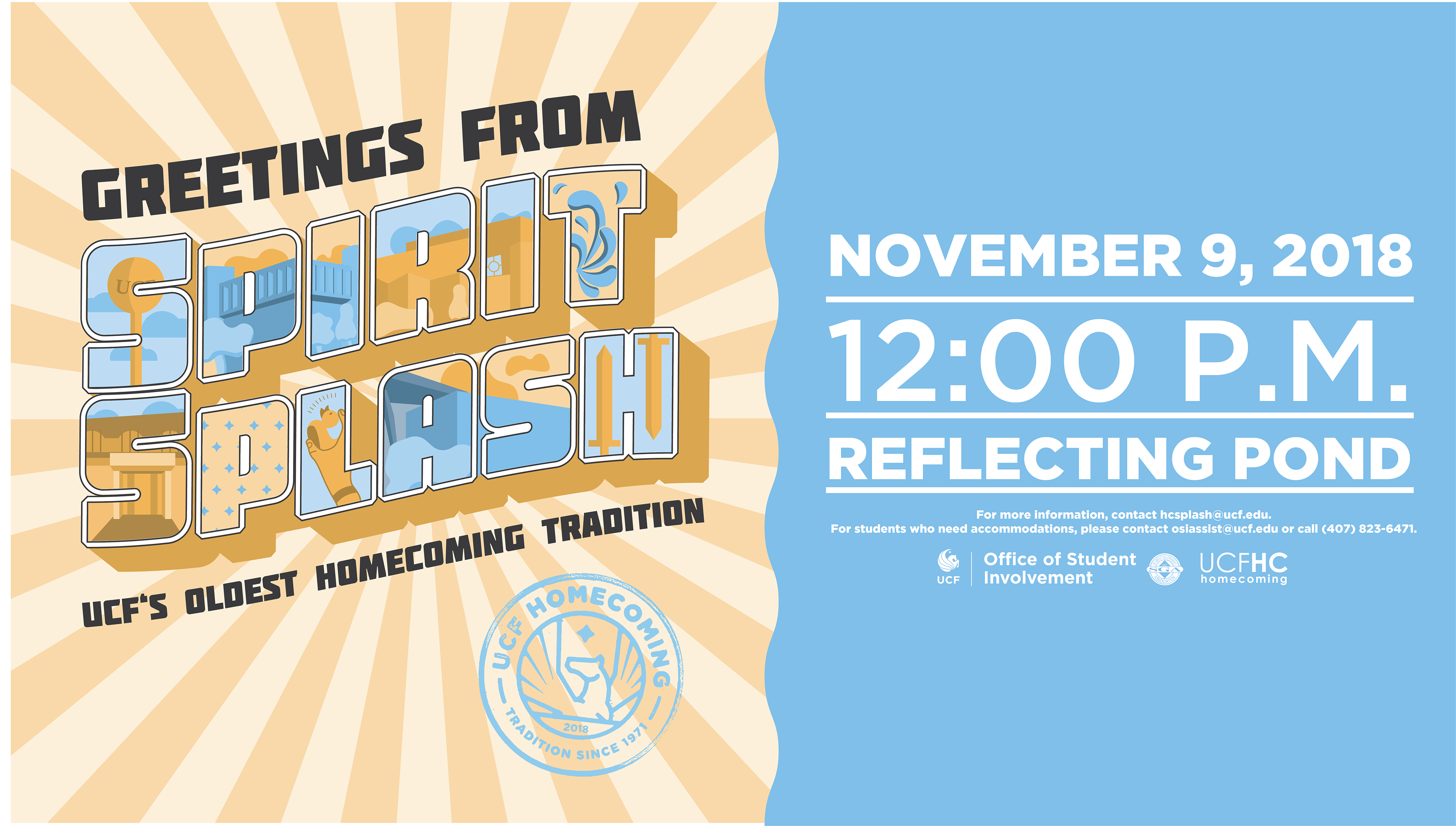
Spirit Splash: Bradley Sinanan
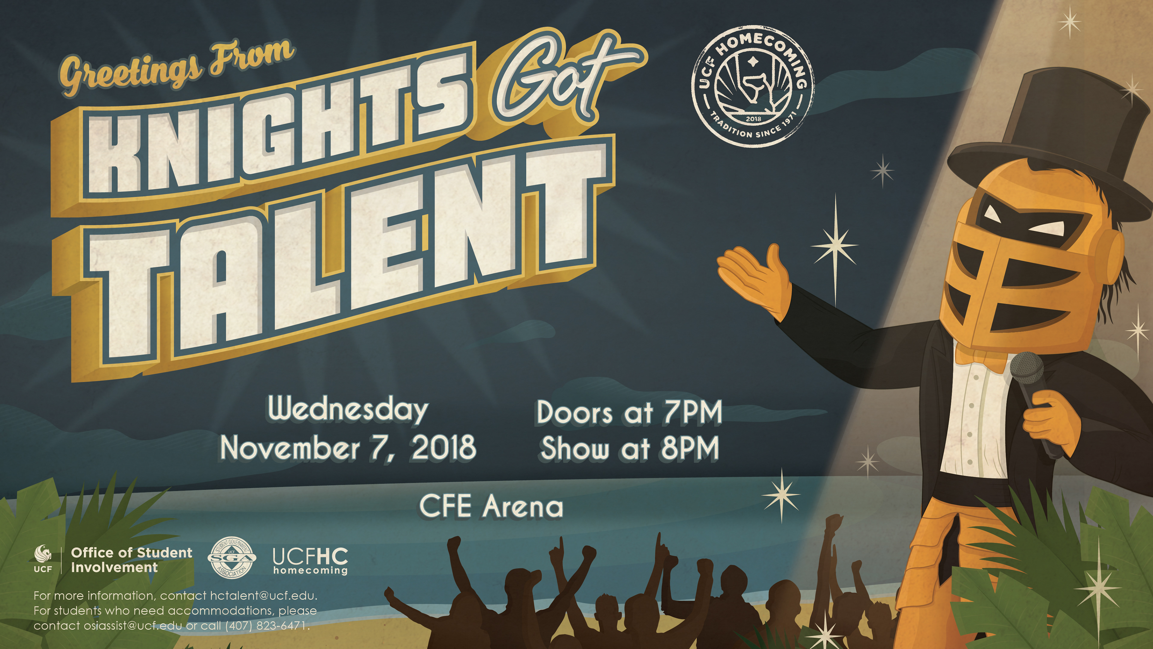
Countdown | Knights Got Talent: Ava Buric